Optimization of all responsive design templates
Optimization of all responsive design templates
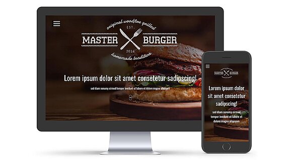
by Daniel FleschThanks to the latest update of our design templates, the texts in the title area have also been responsively optimized. The user defined font sizes have also been adopted for mobile devices, which could previously lead to display problems for large fonts and lot of text.
In order to improve this, we have used a new procedure for newly developed design templates and carried out a customer evaluation. After this was completed with a lot of positive feedback, all existing design templates have been extended by the new functionality.
The new method is based on the so-called "viewport width" (vw). This is a CSS3 unit, which refers to the width of the terminal or the viewing window. For this we analyzed each design and determined, evaluated and defined the respective perfect configuration for the title area through various user tests.
The user does not change anything in the configuration, he still only defines the desktop view in the editor. The new procedure only affects the mobile view of the web page.
This gives our customers - especially those with long titles & subtitles - a better look and readability on mobile devices. This results in an improved overall experience, greater reach and ultimately a better Google ranking.

 Daniel
Flesch